How to Choose the Right Color Palette for Every Room in Your House
Colour may be the most potent element in interior design; it can influence how spaces feel, their size perceptions, and even what energy they will convey on a daily basis. However, when it comes to selecting the right one, homeowners find themselves confused and overwhelmed by the sheer number of options available. The great thing is that selecting the right colors does not have to be guesswork. In fact, there are sound reasons why some combinations work better than others. Here, you’ll learn more about them, and how to choose the right hues for each room in your home. Being one of the experienced interior design company in Kerala, we can provide you the needed assistance, if needed.
Think About the House as a Whole
Before you consider each room individually, take a step back and consider your entire home. It’s common to treat each space in the house as if it were its own separate project. The end result is a space that is disjointed, with each room competing against the other. Generally, a good home utilizes between six and seven colors – a main color, several supporting colors, a trim color, and an accent or two. The color that forms the backbone of the house is the main color, usually a neutral one. This creates the thread that binds all the spaces within the house together, while secondary and accent colors lend personality to each of the spaces. One easy way to begin designing your home is by choosing one neutral color that will be used throughout the home.
The 60-30-10 Rule
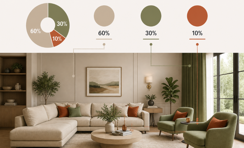
There is one principle that interior designers always adhere to: allocate a room’s color in a ratio of 60%, 30%, and 10% in order of dominance. The color used dominantly occupies walls and other major surfaces. The secondary color is used for upholstery, curtains, and bigger furniture items. The accent color, which is the most vivid among the three, can be found in smaller objects like cushions, paintings, and lamps. This formula works because it maintains a sense of balance while still allowing for variety. This makes the use of color without an overwhelming feel. If you are new to working with colors, consider starting from this formula.
Room by Room – Assess Separately
Living Room
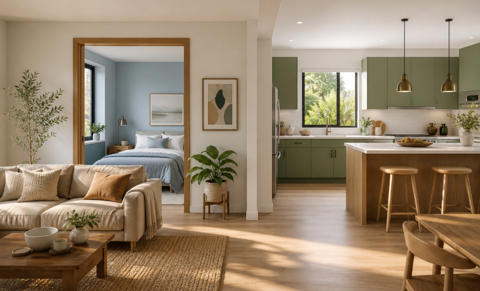
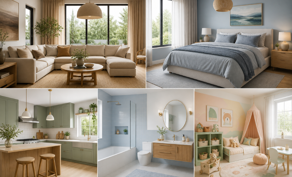
It is in the living room that your house makes an impact — on visitors and on you each day. Beige, taupe, and sand, which are warm neutrals, have performed quite nicely in the living room because they create pretty good ambience. They also allow a lot of freedom while choosing accents. For those who wish to go deeper with their colour scheme, earthy hues such as terracotta and olive green have gained popularity, as they provide warmth without being overpowering other colors. Accents include burnt orange, deep teal, or mustard yellow, used through cushion covers, carpets, and one wall of the living space. In the living room, do not choose cool colours unless your home receives plenty of sunlight throughout the day. This becomes especially important in Indian homes, since natural lighting may vary from room to room in Indian homes.
Bedroom – The Calm Space
Bedroom is where we all rest and like to be calm and cozy. Thus, any colors chosen for the bedroom ought to help create the right atmosphere. The most effective colors in this case include light blues, lavender, sage greens, and soft greys, because numerous studies in color psychology indicate that low-saturation cool colors reduce heart rate and help people get to sleep. Dusty rose, warm blushes, and muted earthy green are all quite relaxing, provided they are used in low saturation. The trick is to use low-saturation colors for your walls and higher saturation only for decorative purposes – like bedding and other decorations which you can change regularly.
Kitchen – The Energetic and Charming Space
The kitchen is also considered as an area of work, and colors should be energetic and fresh. There are shades that have been widely used, such as sage green, warm white, soft mustard, and pale terracotta, which now belong to Indian kitchen colors. Useful method to choose the color – take your dominant fixed item – a countertop, tiling, or cabinets – and use the color palette around it. For example, if your granite countertop has warm shades, use these for your kitchen; if your tiles are expressive enough, build on them. Thus, you will avoid making your kitchen chaotic. It is better not to use deep dark walls in small kitchens because they absorb the light and shrink the space. If dark colors are desired, paint the walls above the countertops.
Bathroom – The Clean Space
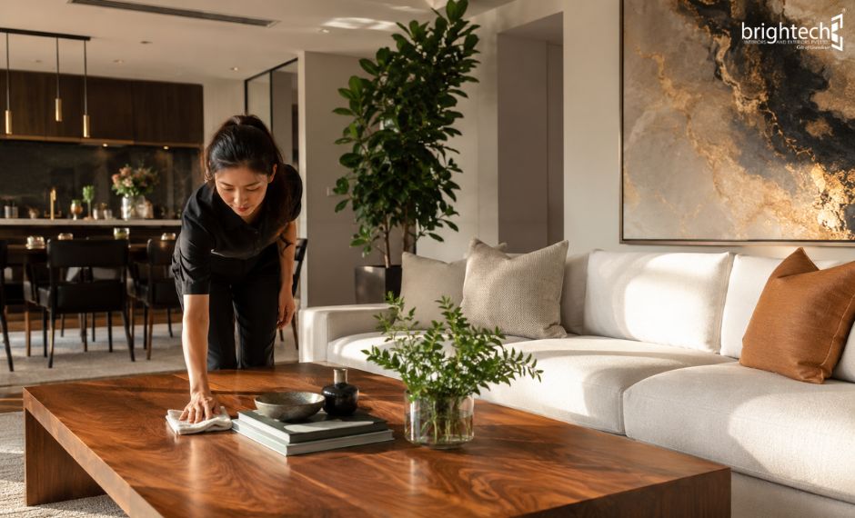
The one place where we tend to overlook the use of color is the bathroom. Colors that signify cleanliness and freshness such as light blue, soft white, sea foam green, and off-white, all serve to convey what you wish to say through your colors here. If you happen to have small bathroom tiles or cannot change your tile color, make sure that your colors complement them rather than making them ugly. Deep charcoal or navy as a focal point for a wall accompanied by white fixtures can add a touch of luxury to your bathroom if the lighting is artificial. Consulting experts is recommended while setting the interior of your house, majority of the people build house once in a life time. Seeking the advice from the best home interior designers in Kerala will be a best strategy if you wish to make your house different from others.
Children’s Room – Playful Place
It is common for parents to automatically go bold with a kid’s room décor, but having all walls saturated with bright hues like red, blue, green, or purple can prove to be visually exhausting not only for the child but also for adults who may occupy the same space from time to time. Instead of painting all walls in bright colors, using a soft base color such as pastel yellow, mint, or peach is recommended.
Never neglect ‘Light’ Factor
One of the most frequent mistake made while selecting a color is that it is selected solely based on how it appears from a paint sample card. The important thing will not be taken into consideration, that is the interplay between light and color within the room. Naturally, sunlight changes from cool to warm through the course of the day. The perfect color may look very different in an Indian south-facing room than in a north-facing showroom during the middle of the day. It is important to remember that paint colors look differently depending on whether it is tested under artificial lighting or natural sunlight. Also, the type of bulb used can alter a color’s undertones.
Select colors Wisely
Selecting colors is both art and science. This will ensure that those frequent color errors, like clashing rooms, wrong lights, or a room that feels either frenetic or boring, are not made, but ultimately it’s important to keep in mind that colors should be selected with people in mind. This is one of the key reasons why Brightech take color consultation is an important factor, as it’s crucial to understand that choosing the right colors can affect the quality of the life of a person. If you are not sure how to start this journey, as a responsible interior design company in Kerala, we’ll gladly lend you a helping hand.